> ## Documentation Index
> Fetch the complete documentation index at: https://docs.talview.com/llms.txt
> Use this file to discover all available pages before exploring further.
# Talview Form Features
> This document provides an overview of all available features in the Talview Form Builder, covering input types, formatting options, field configuration, and layout controls.
***
## 1. Input Collection Features
These are the core building blocks for capturing information from your users.
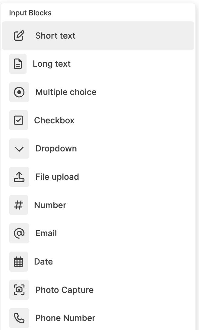 | Feature | Description |
| :------------------ | :----------------------------------------------------------------------------- |
| **Short Text** | Captures single-line input such as names, titles, or short identifiers |
| **Long Text** | Captures multi-line input for detailed descriptions, comments, or explanations |
| **Multiple Choice** | Allows users to select one option from a predefined list |
| **Checkbox** | Allows users to select multiple options from a predefined list |
| **Dropdown** | Provides a collapsible list of options for single selection |
| **Number** | Accepts numeric-only input to ensure numerical data accuracy |
| **Email** | Captures email addresses in a structured format |
| **Phone Number** | Captures contact numbers using a dedicated phone input field |
| **Date** | Allows users to select a date through a calendar interface |
| **File Upload** | Enables users to attach documents or files within the form |
| **Photo Capture** | Allows users to capture and upload images directly from their devicec |
***
## 2. Content & Formatting Features
Use these blocks to add context, instructions, and structure to your form content.
| Feature | Description |
| :------------------ | :----------------------------------------------------------------------------- |
| **Short Text** | Captures single-line input such as names, titles, or short identifiers |
| **Long Text** | Captures multi-line input for detailed descriptions, comments, or explanations |
| **Multiple Choice** | Allows users to select one option from a predefined list |
| **Checkbox** | Allows users to select multiple options from a predefined list |
| **Dropdown** | Provides a collapsible list of options for single selection |
| **Number** | Accepts numeric-only input to ensure numerical data accuracy |
| **Email** | Captures email addresses in a structured format |
| **Phone Number** | Captures contact numbers using a dedicated phone input field |
| **Date** | Allows users to select a date through a calendar interface |
| **File Upload** | Enables users to attach documents or files within the form |
| **Photo Capture** | Allows users to capture and upload images directly from their devicec |
***
## 2. Content & Formatting Features
Use these blocks to add context, instructions, and structure to your form content.
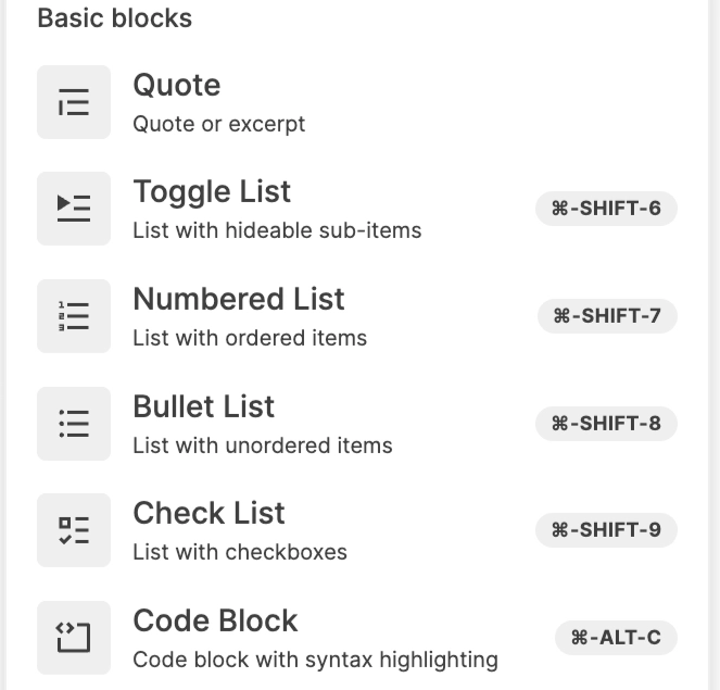 | Feature | Description |
| :---------------- | :--------------------------------------------------------------------------- |
| **Quote Block** | Displays highlighted text to emphasize important information or instructions |
| **Bullet List** | Presents information in an unordered list format |
| **Numbered List** | Displays content in a sequentially numbered format |
| **Check List** | Creates an interactive checklist where items can be marked as completed |
| **Toggle List** | Creates expandable and collapsible sections to manage long content |
| **Code Block** | Displays formatted code with syntax highlighting for technical content |
***
## 3. Hierarchical Structuring Features
Organise your form into clear, collapsible sections using heading-based toggles.
| Feature | Description |
| :---------------- | :--------------------------------------------------------------------------- |
| **Quote Block** | Displays highlighted text to emphasize important information or instructions |
| **Bullet List** | Presents information in an unordered list format |
| **Numbered List** | Displays content in a sequentially numbered format |
| **Check List** | Creates an interactive checklist where items can be marked as completed |
| **Toggle List** | Creates expandable and collapsible sections to manage long content |
| **Code Block** | Displays formatted code with syntax highlighting for technical content |
***
## 3. Hierarchical Structuring Features
Organise your form into clear, collapsible sections using heading-based toggles.
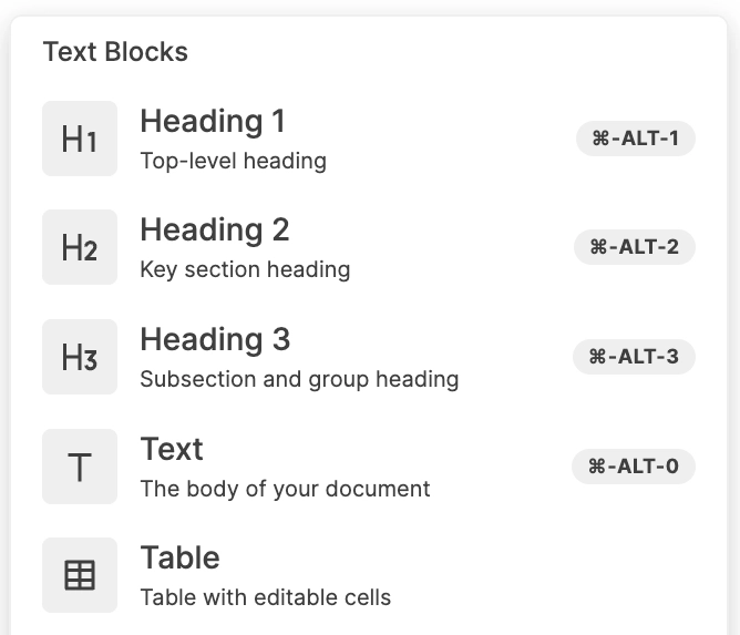 | Feature | Description |
| :------------------------ | :---------------------------------------------------------------------- |
| **Toggle Heading 1 (H1)** | Creates a top-level collapsible section for organising major form areas |
| **Toggle Heading 2 (H2)** | Creates a secondary collapsible section within main sections |
| **Toggle Heading 3 (H3)** | Creates subsection-level collapsible groupings within sections |
***
## 4. Media Embedding Features
Enrich your forms with visual and video content to guide users effectively.
| Feature | Description |
| :------------------------ | :---------------------------------------------------------------------- |
| **Toggle Heading 1 (H1)** | Creates a top-level collapsible section for organising major form areas |
| **Toggle Heading 2 (H2)** | Creates a secondary collapsible section within main sections |
| **Toggle Heading 3 (H3)** | Creates subsection-level collapsible groupings within sections |
***
## 4. Media Embedding Features
Enrich your forms with visual and video content to guide users effectively.
 | Feature | Description |
| :-------------- | :------------------------------------------------------------------------------- |
| **Video Block** | Embeds video content within the form for instructional or informational purposes |
| **Image Block** | Embeds images within the form to provide visual context or references |
***
## 5. Structural Grouping Features
Logically group related fields together to improve form flow and readability.
| Feature | Description |
| :-------------- | :------------------------------------------------------------------------------- |
| **Video Block** | Embeds video content within the form for instructional or informational purposes |
| **Image Block** | Embeds images within the form to provide visual context or references |
***
## 5. Structural Grouping Features
Logically group related fields together to improve form flow and readability.
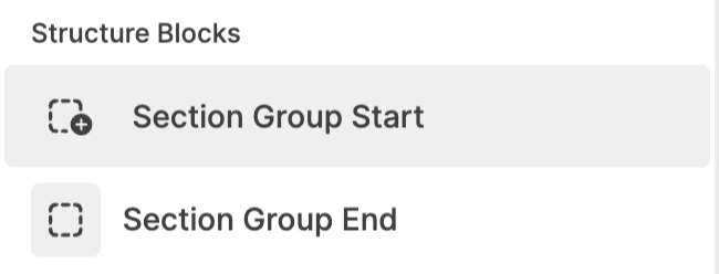 | Feature | Description |
| :---------------------- | :----------------------------------------------------------- |
| **Section Group Start** | Marks the beginning of a logically grouped section of fields |
| **Section Group End** | Marks the end of a logically grouped section of fields |
***
## 6. Advanced Features
Take your forms further with intelligent, dynamic behaviour.
| Feature | Description |
| :---------------------- | :----------------------------------------------------------- |
| **Section Group Start** | Marks the beginning of a logically grouped section of fields |
| **Section Group End** | Marks the end of a logically grouped section of fields |
***
## 6. Advanced Features
Take your forms further with intelligent, dynamic behaviour.
 | Feature | Description |
| :-------------------- | :---------------------------------------------------------------------------- |
| **Conditional Logic** | Controls the dynamic visibility of fields or sections based on user responses |
***
## 7. Field Configuration Features
Fine-tune how each field behaves, appears, and validates input.
| Feature | Description |
| :-------------------- | :---------------------------------------------------------------------------- |
| **Conditional Logic** | Controls the dynamic visibility of fields or sections based on user responses |
***
## 7. Field Configuration Features
Fine-tune how each field behaves, appears, and validates input.
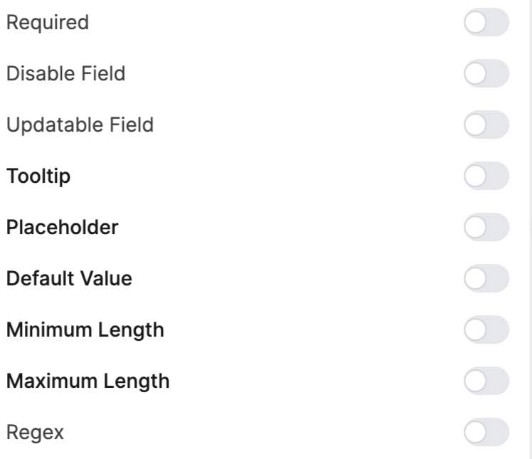 | Feature | Description |
| :------------------- | :--------------------------------------------------------------------------- |
| **Field Identifier** | Defines the internal reference name used for backend mapping or integrations |
| **Label** | Defines the visible name displayed to users for the field |
| **Required** | Marks a field as mandatory before form submission |
| **Disable Field** | Makes a field visible but non-editable |
| **Updatable Field** | Controls whether a field can be edited after submission |
| **Tooltip** | Provides contextual helper information for users interacting with a field |
| **Placeholder** | Displays example text inside the field before user input |
| **Default Value** | Pre-populates a field with a predefined value |
| **Minimum Length** | Sets the minimum number of characters allowed for input |
| **Maximum Length** | Sets the maximum number of characters allowed for input |
| **Regex Validation** | Applies pattern-based validation rules for advanced input control |
***
## 8. Layout & Design Features
Control the visual arrangement and management of fields within your form.
| Feature | Description |
| :------------------- | :--------------------------------------------------------------------------- |
| **Field Identifier** | Defines the internal reference name used for backend mapping or integrations |
| **Label** | Defines the visible name displayed to users for the field |
| **Required** | Marks a field as mandatory before form submission |
| **Disable Field** | Makes a field visible but non-editable |
| **Updatable Field** | Controls whether a field can be edited after submission |
| **Tooltip** | Provides contextual helper information for users interacting with a field |
| **Placeholder** | Displays example text inside the field before user input |
| **Default Value** | Pre-populates a field with a predefined value |
| **Minimum Length** | Sets the minimum number of characters allowed for input |
| **Maximum Length** | Sets the maximum number of characters allowed for input |
| **Regex Validation** | Applies pattern-based validation rules for advanced input control |
***
## 8. Layout & Design Features
Control the visual arrangement and management of fields within your form.
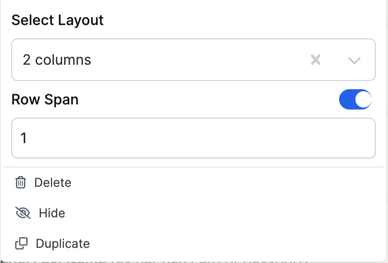 | Feature | Description |
| :------------------------------------ | :------------------------------------------------------------------- |
| **Column Layout (1 / 2 / 3 Columns)** | Controls how fields are arranged horizontally within the form layout |
| **Row Span** | Determines how much vertical grid space a field occupies |
| **Delete** | Removes a field from the form |
| **Hide** | Temporarily hides a field without deleting it |
| **Duplicate** | Creates a copy of an existing field with the same configuration |
***
## Form embedded in different applications
### 1. Candidate form on the CX application (Web)
| Feature | Description |
| :------------------------------------ | :------------------------------------------------------------------- |
| **Column Layout (1 / 2 / 3 Columns)** | Controls how fields are arranged horizontally within the form layout |
| **Row Span** | Determines how much vertical grid space a field occupies |
| **Delete** | Removes a field from the form |
| **Hide** | Temporarily hides a field without deleting it |
| **Duplicate** | Creates a copy of an existing field with the same configuration |
***
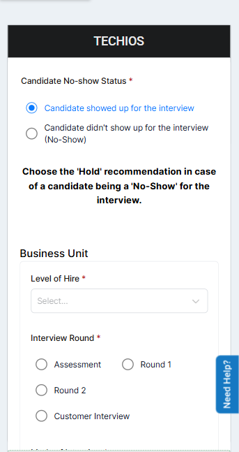
## Form embedded in different applications
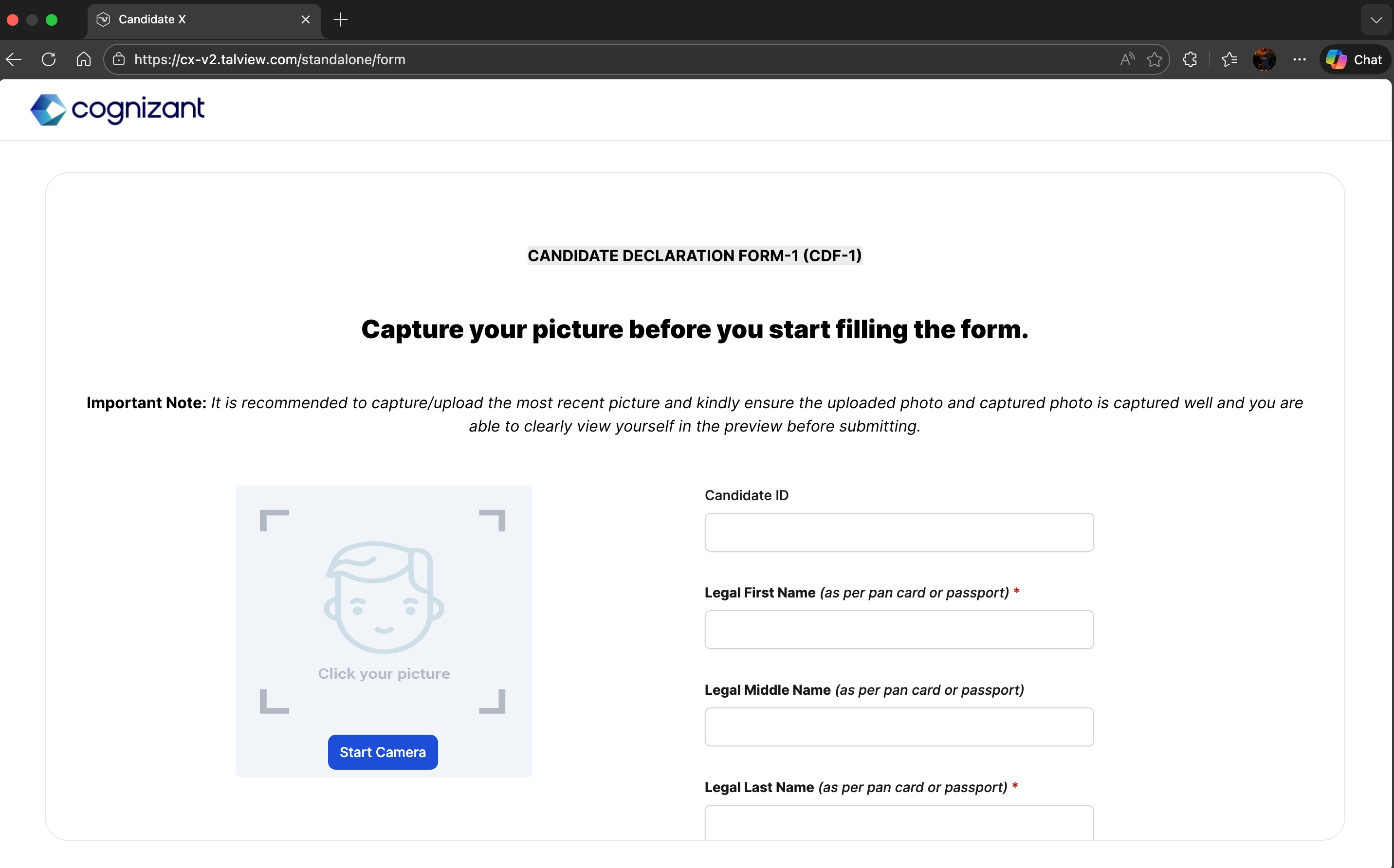
### 1. Candidate form on the CX application (Web)
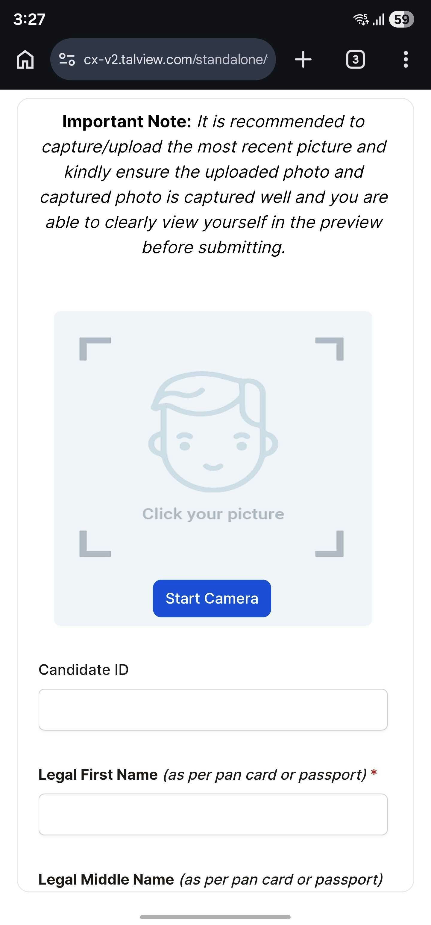
 ### 2. Candidate form on CX application (Mobile view)
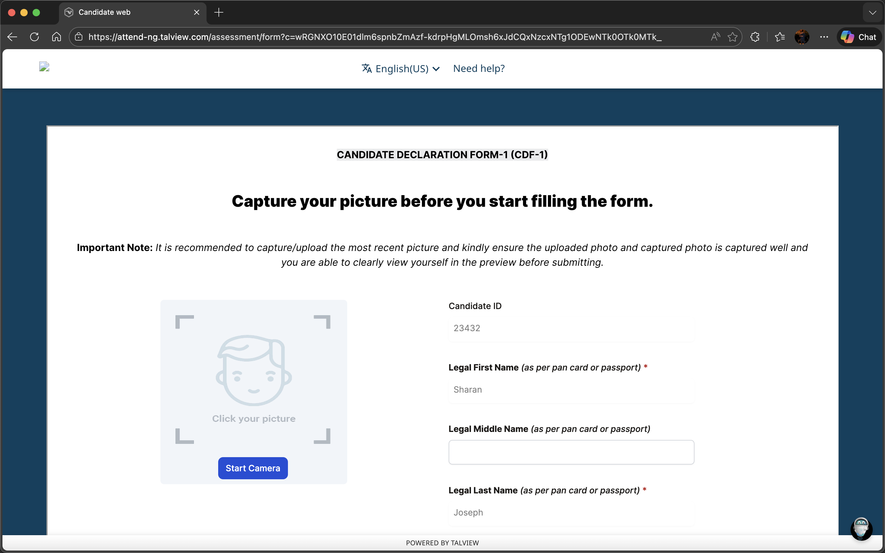
 ### **3. Candidate form on the attend-ng application (Web)**
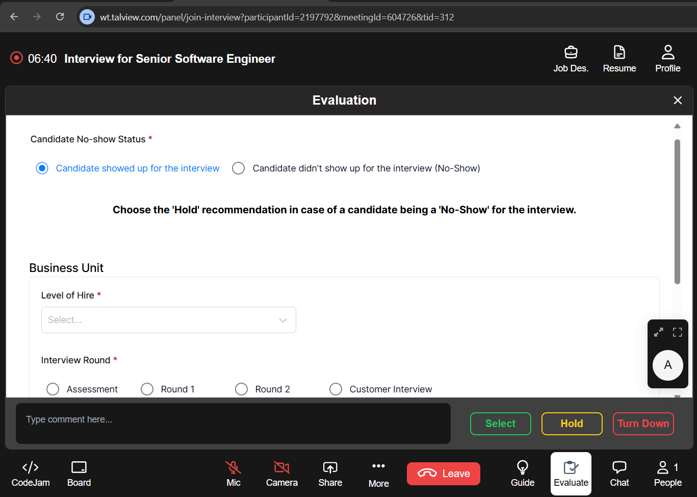
 ### **4. Evaluation form on Workflow tools application**
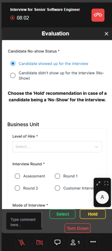
 ### **5. Evaluation form on workflow tools application (Mobile view)**
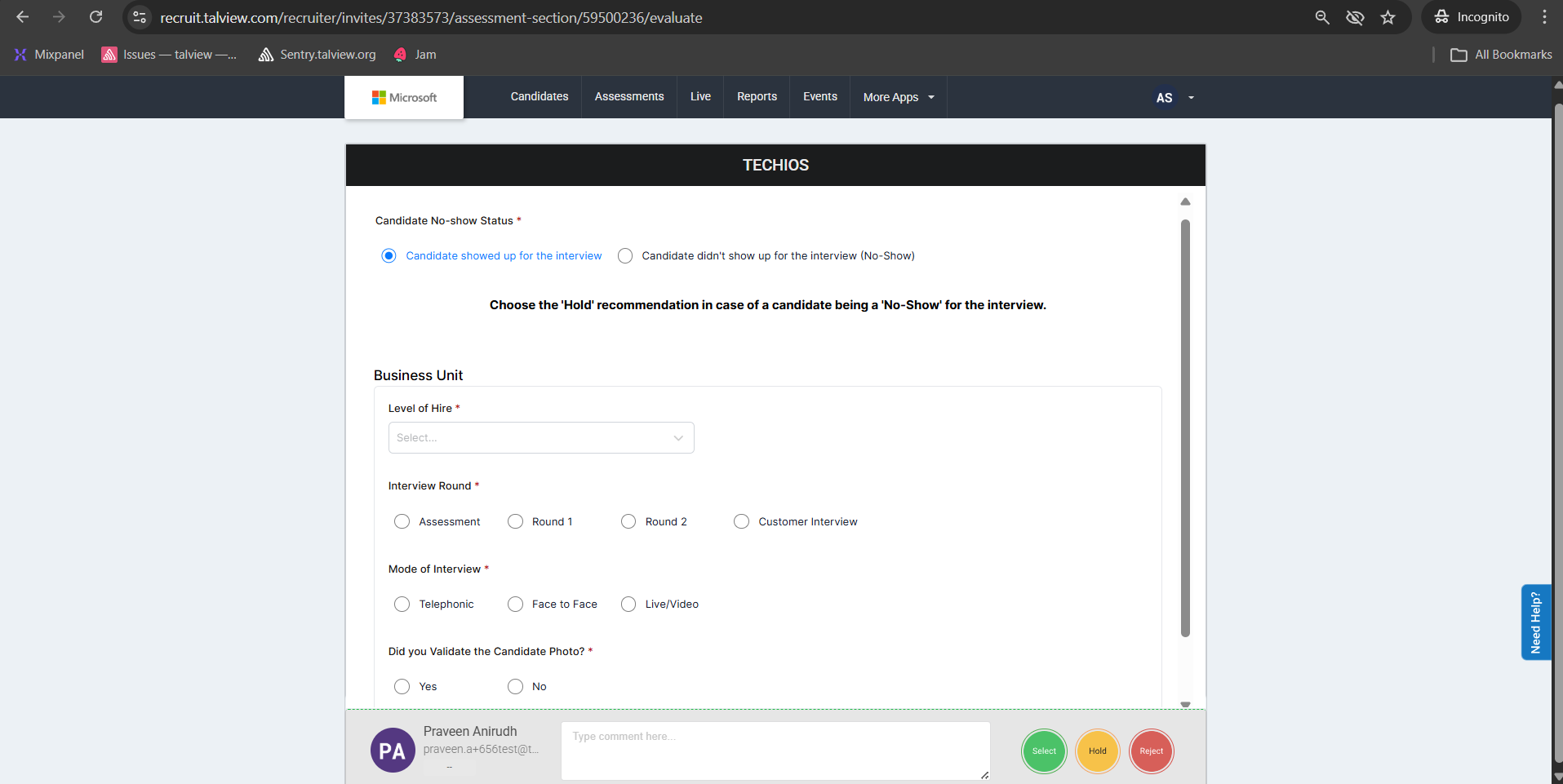
 ### 6. Evaluation form on the Recruit web application
 ### 7. Evaluation form on the Recruit (Mobile view)
 ***
***